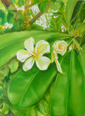
When I paint, after each session I take a digital picture. Perhaps its strange to study a photo of the work when the actual work is sitting right in front of me but, I still use the good old tricks like turning the work upside down to find errors in proportions or things that jump out that shouldn't. I find that the same applies to digital photo's with the added bonus of being able to go back and see from start to finish how I progressed. I also still use my colour wheel and charts. In fact, every time I buy a new tube of paint I paint it into my chart with a note next to it telling me if its hot or cold, transparent or opaque.....Someday I hope to be able to switch my brain off and paint on instinct and actually know what I'm doing!...Someday!
This painting I did this week for a dear friend and I hope she loves it as much as I loved painting it for her. It is oil on canvas 18" by 24", Untitled for now.


2 comments:
Hi Samantha, it's really good to see the work in progress shots. I can see you didn't deviate from your initial sketch and saw the original idea right through to the end.
You've handled the greens well, the leaves look really juicy and lush. Green can be a tricky colour to mix and use sometimes, but you've nailed it here, there's no sense of artificiality in it.
You said, "Someday I hope to be able to switch my brain off and paint on instinct and actually know what I'm doing!", well you probably do for some of the time without realising it.
When conditions are just right, you sit at the easel, get into the zone, time stands still, and there's a masterpiece looking back at you and you just wonder where it came from. But it's very, very rare.
Regarding reviewing your work on the screen, I find that very useful too. In particular for checking values. It's so easy for the brain to get confused with colours it's good to see the image using the grey scale so you can see where your lights and darks fall.
I think your friend will be delighted with the painting and will see the love you've poured into it. 18 x 24 is a nice size too.
Thanks John. Green is a challenge for me at the moment I use it working from dark to light. The cadmium seems to be punchier over a darker (not fully dry) shade of the sap green with a touch of pthalo blue. Quite a limited palette I used here. I do use the grey scale quite often, very useful tool, In fact I cant remember how I used to work without the aid of technology - it is remarkable to me how processes have changed in a relatively short period of time.
Thank you for your comment John :)
Post a Comment